1. Overview
Dashboard is the primary tool for event coordinators to monitor a food distribution event in real time. As volunteers check clients in using the CheckIn app, the Dashboard updates live — giving coordinators an immediate picture of how many families have been served and how much food inventory remains.
2. Login
All volunteers share a single password for the event. You will receive the password from your event coordinator.
- Open the Dashboard application in your browser or on your device.
- Enter the shared password provided by your coordinator.
- Tap Login.
- You will be taken directly to the Event Summary screen.
3. Event Summary
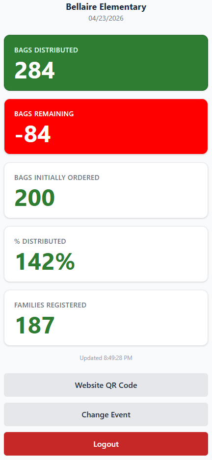
After logging in, the Event Summary screen displays real-time statistics for the current event at the selected location. The location name and date are shown at the top, and five tiles update automatically as check-ins occur.
Tiles
Bags Distributed
The number of bags that have been handed out so far during this event.
Bags Remaining
The number of bags still available at this location — calculated as Bags Initially Ordered minus Bags Distributed.
Bags Initially Ordered
The total number of bags that were ordered for this event.
% Distributed
The percentage of the total order that has been distributed so far.
Families Registered
The number of families that have been checked in at this event.
4. Website QR Code
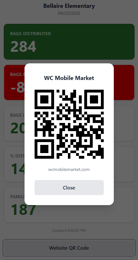
The Website QR Code button displays a full-screen QR code that clients can scan with their phone camera. Scanning it navigates them directly to the WC Mobile Market website at wcmobilemarket.com.
The website contains the event calendar showing all upcoming distribution dates and locations. Clients can use it to find out when and where we will be serving in their area.